Gather app logo and wordmark
End-to-end Mobile Application
ROLE
Black and white profile icon to indicate role
UX Research
Brand
Wireframing
Visual Design
Interaction Design
Prototyping
Usability Testing
TIMEFRAME
Black and white clock icon to indicate timeframe
November - December 2021
4 weeks
PROJECT TYPE
Black and white chart icon to indicate project type
Designlab UX Academy
Student Project
TOOLS
Black and white wrench icon to indicate tools
Figma
Google Forms
Maze
Solo travel has become increasingly popular over the past several years, and even more so post pandemic. After staying at home for so long, many people are eager to see the world and go on adventures. But gone are the days of waiting around for your friends or family to make plans, and circumstances are changing so quickly these days that we just want the freedom of flexibility.
131%
increase in Google searches related to solo travel between 2016 and 2019.
18%
of global bookings are made by solo travelers.
THE OPPORTUNITY
Traveling can be stressful and overwhelming, especially when you’re doing it on your own. Traditional travel resources and guides may not be suitable for the needs of a solo traveler.
How might we improve and add value to the travel experience for solo travelers?
THE SOLUTION
An end-to-end mobile app platform that allows locals from all over the world to host meals and dining experiences in their homes for travelers. Hosts can determine the menu and cost, and travelers can browse options available in their destination. This gives solo travelers a chance to immerse in local culture, meet locals, and have a social dining experience.

A GIF of the Gather app's homepage, category page, and listing page on an iPhone X.

THE DOUBLE DIAMOND PROCESS

I used the Double Diamond design process because I wanted to thoroughly research the solo travel industry and define the problems before narrowing down a solution to focus on.
Double Diamond design process diagram
01 Discover
Primary Research
Secondary Research
Problem Definition
02 Define
Empathy
Information Architecture
03 Develop
Wireframes
Brand
Visual Designs
04 Deliver
Prototype
Test
Revisions
MVP
01 Discover

I started by conducting primary and secondary research in order to learn everything I could about the solo travel industry and the people who travel solo. I wanted to discover their motivations and pain points, and identify any gaps in their experiences.

What am I trying to learn?
Number 1 in a circle logo
Who are solo travelers and what are their behaviors towards solo travel?
Number 2 in a circle logo
What currently existing products cater to solo travel?
Number 3 in a circle logo
What are their motivations and pain points?

THE RESEARCH PROCESS

The Solo Travel Industry at a Glance
Circular icon of a brown travel suitcase.
88% of solo travelers are looking for unique and non-touristy experiences
Learning From the Competitors
Travello app icon
Solo app icon
Tripadvisor app icon
Hosteworld app icon
Instagram app icon

There are very few apps available dedicated to just solo travelers, and even less that have active users. Most of these directly competing apps either help solo travelers make social connections, like Travello, or provide travel guides and resources, like Solo.

On the other hand, there are apps that dominate the travel industry, like TripAdvisor and Hostelworld, but do not offer resources specifically to solo travelers.

Then there’s Instagram, an industry leader in social media. Although it’s not a travel product, Instagram can be used to discover travel related content.

Thought bubble icon
Each competitor has something different to offer, and it's important to note why users prefer each one and incorporate those successes into my product. Travello and Solo offer specific solo travel resources, Tripadvisor and Hostelworld are trusted because they have thousands of community reviews, and Instagram makes sharing and discovering travel content so easy.
Surveying the Users

I wanted to validate my secondary research findings with primary research, and dive deeper into user behavior and experiences.

Process: I conducted user surveys through Google Forms, with 14 multiple choice and open-ended questions, over the period of 3 days.

Recruitment: Facebook and Reddit solo travel groups

Participants: 19 participants with experience traveling solo

Research Findings:

Number one circle logo
88.2% of participants were female.
Number two circle logo
82% of participants are motivated by the freedom of solo travel.
Number three circle logo
64.7% of participants prioritize learning about local culture.
Number four circle logo
70.6% of participants are most concerned about safety.
Number five circle logo
42% of participants have felt lonely while traveling solo.
Graphic of a female with black hair wearing a black shirt
"I learn more about myself, and I feel more empowered to meet new people and try new things."
Graphic of a woman with black hair wearing an orange shirt
"Freedom to do what I want, when I want. Meeting interesting people. Learning about new places and cultures. Being able to go at my own pace, to enjoy local food and drink, to indulge my photography habits."
Graphic of a woman with black hair wearing an orange shirt
"I have to be very aware of my environment at all times, to make sure I'm not taken advantage of or worse."

THE PROBLEM

What opportunities does the research present?
Thought bubble icon
I initially thought the research would lead me to create a social app that connects solo travelers with other solo travelers. I had the assumption that people traveling alone wanted to meet people, because that was my personal experience. I was surprised to discover from my research that most solo travelers do not prioritize meeting people, an interesting insight that will help me reframe the problem.

Across my research, I uncovered patterns in the top motivators and frustrations amongst solo travelers.

TOP 3 MOTIVATORS
Number one circle logo
Freedom and Self-discovery
Number Two Circle Logo
Local Culture
Number Three Circle Logo
Unique Experiences
TOP 3 FRUSTRATIONS
Number one circle logo
Safety
Number Two Circle Logo
Cost
Number Three Circle Logo
Loneliness

How can I take user's motivations into consideration while also addressing their frustrations with solo travel? While there are ample solutions available to address the concerns of personal safety and finance, there aren’t many travel solutions to address loneliness.

Thought bubble icon
What really intrigued me about this concern was a pattern I found specifically related to loneliness while eating.
Graphic of a woman with black hair wearing an orange shirt
"It can be awkward to eat alone."
Graphic of a female with black hair wearing a black shirt
"The biggest barrier is the fact that I can't order a variety of food because I can't finish on my own and food is love to me."
Graphic of a woman with black hair wearing an orange shirt
"I still feel out of place drinking in a bar alone."

This narrows down my focus and redefines the problem.

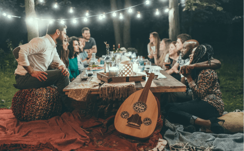
How might we make the dining experience more comfortable and enjoyable for solo travelers?

02 Define
Thought bubble icon
Next, it’s time to start empathizing with the users who experience this problem!

I reorganized the research findings into an empathy map to better articulate what we know, and then created a single persona to help me relate to the user throughout the design process.

THE EMPATHY MAP

UX Empathy Map of Gather app users

THE PERSONA

Thought bubble icon
Samar is made up of user patterns discovered in the research process.
Meet Samar

Samar is a frequent solo traveler who loves to explore new places off the beaten path. It’s important for her to really immerse herself into the culture wherever she goes, and learn about local traditions, people, and food. She’s a self-proclaimed foodie who is always sharing photos of different cuisines on social media. Although she enjoys the flexibility and independence of solo travel, she wishes she had someone to share food with so she could try more things.

Gather app Persona deliverable

THE POTENTIAL SOLUTIONS

What might Samar be interested in?
Number 1 in a circle logo
Connecting solo travelers who are looking for others to dine out with. They are able to create groups, make events, and book restaurant reservations.
Number 2 in a circle logo
Locally hosted unique dining experiences for solo travelers. Hosts set the menu and price, and travelers can browse dining experiences in their area.
Number 3 in a circle logo
Sourcing restaurants and food establishments that are solo dining friendly and providing their offerings to solo travelers in one place.
Thought bubble icon
I ultimately decided to build upon the second idea because it not only solves Samar’s frustrations with dining alone, it also offers authentic cultural immersion and unique travel experiences.

THE USER JOURNEY MAP

How will Samar interact with the product?

Mapping out Samar’s journey of discovering and interacting with the product will help uncover opportunities and potential features that will add value to her travel experience, such as verified hosts and in-depth customer feedback.

A User Journey Map showing Gather's users interaction with the app.

THE SITE FLOW

How will Samar navigate the product?
Thought bubble icon
Now that I have an idea what kind of product I'm building, it's time to give it some structure and determine what screens need to be built to showcase Samar’s booking flow.

I mapped out what the app could look like, and in order to showcase the booking flow I would be creating a homepage, category page, listing page, booking page, and confirmation page.

03 Develop

THE WIREFRAMES

The following wireframes shows Samar’s journey of booking a dining experience through the app. The screens start from the homepage all the way through to the booking confirmation.

Wireframes of the Gather app showing the user booking journey.
Click to see full wireframes.

THE BRAND

Next, I give the brand some identity! I brainstormed various names and logos based on a mood board that I created to showcase the look and feel of the brand. I really wanted this brand to feel warm, inviting, and authentic. I decided to call the app 'Gather' because it is meant to bring people together, ultimately through food

Brainstorming Ideas
A brainstorm of the app's name and logo.
Thought bubble icon
I really wanted to incorporate the social and dining aspects of this app into its brand name and logo. I think the use of the shade orange brings a happy and inviting look and feel.
A Warm and Inviting Style Guide
Gather app style guide showcasing images, brand look and feel, color palette, typography, and logos.
People dining at a banquet table.
Two women embrace after exchanging gifts.
A group of people sitting at a table outdoors during nighttime entertaining socially.
A woman taking a selfie of a group sitting at a dinner table having a holiday meal.
A bird's eye view of a variety of Italian dishes and food on a wooden table.

THE UI KIT

A UI Kit for the Gather app showcasing buttons, form fields, and cards.

THE VISUAL DESIGNS

Gather's Key Features
A digital mock up of the Gather homepage on an iPhone.
Personalization

Homepage defaults to the user’s destination based on location services to help solo travelers quickly find what they want. Users can also find other locations through the search feature.
A digital mock up of the Gather host section on an iPhone.
Verified Hosts

Hosts you can trust with authenticated profiles and identity verification. Users are able to send messages to the host about their events.
Three digital mock ups showcasing Gather's filter system on iPhones.
Extensive Filters

Users waste no valuable travel time and are able to find exactly what they are looking for, especially specific food requirements.
Gather app mobile screens
04 Deliver

THE PROTOTYPE

My final prototype shows Samar’s reservation journey on the Gather app, from the splash screen through to the confirmation, and viewing her reservations.

THE USABILITY TEST

I tested the Gather mobile prototype to discover how users perceive Gather as a brand, if users can navigate the app with ease, and identify any challenges.

Process: I conducted unmoderated usability tests with Maze to allow users to participate at their own convenience, with Retrospective Probing to discover intentions behind actions.

Participants: 16 participants with experience traveling solo

Number 1 in a circle logo
Task 1:
Allow Gather to access your location while using the app. Explore the homepage.
Number 2 in a circle logo
Task 2:
See what dinner experiences are available.
Number 3 in a circle logo
Task 3:
Book a dining experience.
Number 3 in a circle logo
Task 4:
Find the booking you just made.

Insights: All participants completed 100% of the tasks, and the majority of feedback was positive. Participants said the app was organized and easy to navigate, and that the color palette complemented the app well. There were no remarkable pain points, but a couple of participants said the center-aligned text could be hard to read, the language of some buttons were confusing, and they would like to see more event information.

I created an affinity map to organize all of my usability test findings and then assessed the priority value of possible opportunities for reiteration.

Finally, I made the following revisions to the design that I considered high value and low effort.

Number one circle logo
Add additional information regarding parking, attire, Covid safety, etc, to help with customer’s decision making.
Number two circle logo
Left align body text for more effective readability.
Number three circle logo
Change Listing button language to let users know they can see and book other dates.
Number four circle logo
Decrease the size of the ‘Map View’ button to minimize distraction from the page.
Number five circle logo
Change ‘My Meals’ page title to something more familiar to customers.
Number five circle logo
Give users the option to change their booking within the confirmation page.
What's next?

NEXT STEPS

I would reiterate upon the high value and high effort priority of including information about other attending guests. This isn’t common for booking experiences to provide, but since this is a more intimate and social experience, I can see the merit in it. There would be concerns of privacy of other attendees to address as well.

I would also be interested in giving life to other parts of the Gather app such as host profiles, and designing the app from the host’s perspective.

LESSONS LEARNED

I was surprised to discover that my own experiences and values as a solo traveler differ from the majority of other solo travelers. It was another lesson that continues to reinforce the significance of research and challenge my assumptions and biases.
This project also taught me to see beyond my own perspective of the user. Users come in all shapes, sizes, and circumstances. For the Gather app, our users aren’t just the customers who purchase dining experiences, they’re also the hosts who use the app to promote their product.

FINAL THOUGHTS

This was the first project where I had complete autonomy from beginning to end. I decided what industry to work on, what product to create, and how to build it. It was really cool to see my idea come together throughout each process, and being able to bring it to life.